CHI 2026 | Dashboard Too Complex? Don't Only Add a Chat Box — Let AI Point
Diana combines voice, text, mouse pointing, and visual highlighting so users can onboard to a dashboard the way they would ask an expert.
Many dashboard problems are not that data is missing, but that users do not know where to look, what to click, or how to connect several charts.
Traditional fixes are documentation, recorded videos, and onboarding tours. They help to a point, but when the dashboard updates, the materials must follow; worse, when users are stuck, what they lack is often not another paragraph of explanation, but someone who understands the current question and can point to a concrete place.
Diana, proposed in this CHI 2026 paper, does not aim to hang another chatbot beside the dashboard. It brings together voice, text, mouse pointing, and visual highlighting, so AI assistance lands on the current chart and the current task.
📌 Paper information
Original title: "Hey Dashboard!": Supporting Voice, Text, and Pointing Modalities in Dashboard Onboarding using Large Language Models
Authors and affiliations: Vaishali Dhanoa, Gabriela Molina León, Eve Hoggan, Eduard Gröller, Marc Streit, Niklas Elmqvist. Authors are affiliated with Aarhus University, TU Wien, VRVis, Johannes Kepler University Linz, and related institutions.
Venue: CHI 2026, Barcelona, Spain.
Paper link: https://doi.org/10.1145/3772318.3791766
The real question: can AI onboarding explain in place, like a human expert?
Dashboard onboarding is hard because it is not merely teaching one button. Modern dashboards often have linked views, filters, drill-down, hover tooltips, and multi-view coordination. Users need to understand not only "what this chart is," but also "for this task, which region should I look at, how should I interact, and where does the result come from."
Human experts work because they can do three things at once: hear the question, point at the interface, and explain from the current data. Ordinary documents and static tours struggle here; a pure-text chatbot also tends to float outside the interface, leaving users to map language back onto the dashboard themselves.
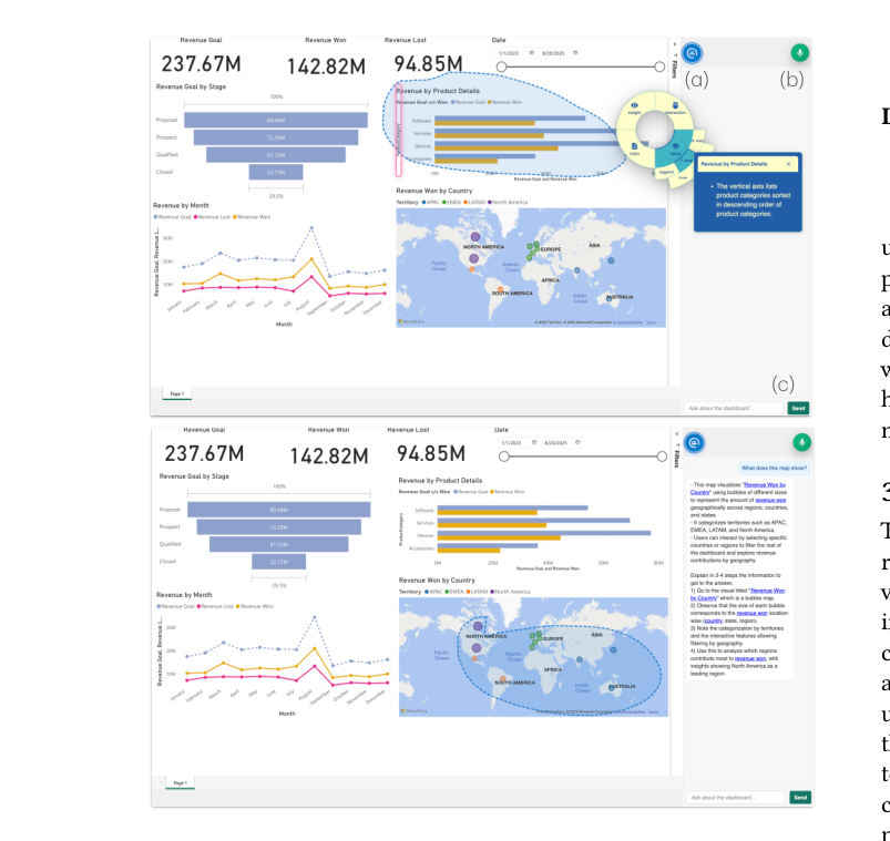
Diana tries to close that gap. Users can ask by voice or text, or lasso a region with the mouse; when the system answers, it does not only return text or speech — it also highlights relevant charts, axes, legends, or data regions in the dashboard.
![Figure 1: Multimodal interaction for dashboard onboarding using LLMs. Building on the process model for dashboard onboarding
proposed by Dhanoa et al. [12], we extend the model with multimodal interactions and LLM-powered features for user onboarding.](/images/blog/2026-06-08-dashboard-ai-should-point/chart_1_46.png)
Diana's key is not "having an LLM," but how modalities connect
The paper defines Diana as Dashboard Interactive Assistant for Navigation and Analysis. It runs on a Microsoft Power BI dashboard, uses a GPT-powered agent, and supports speech input/output through the OpenAI Realtime API.
Users have three main input modes: keyboard chat, speech, and mouse interaction. Mouse support includes hover and lasso selection, so users can first circle a chart region and then follow up by voice or text. Outputs include text, audio, a contextual menu, and visual highlights.
As Figure 2 shows, Diana's interface does not isolate the chat window beside the dashboard; answers are bound to concrete visualization regions. When users ask about an x-axis, legend, chart, or region, the system highlights the relevant part so language and visual objects can align.
An important limit: Diana does not compute answers for you
This is easy to misread. Diana is not a BI agent that looks up numbers and returns answers. The authors state clearly that Diana does not access underlying data values and cannot directly operate the data model. It mainly relies on dashboard metadata, dashboard description, visual description, and author-provided descriptions to generate onboarding explanations.
Diana's role is closer to a guide than an analyst. It can tell you where to look, how to filter, and how to read chart structure — but it will not compute the answer for you.
That boundary matters. On one side, it lowers hallucination and miscalculation risk; on the other, it limits help on calculation-heavy tasks. When a task requires summing multiple points, adding values, or comparing across charts, Diana can only guide steps, not fully replace data queries.
How the study ran: 6 with Diana, 6 with a static guide only
The authors first ran a 4-person formative study to refine tasks and system features. The main study included 12 participants: 6 used Diana plus a standard user guide; 6 used only a static dashboard guide.
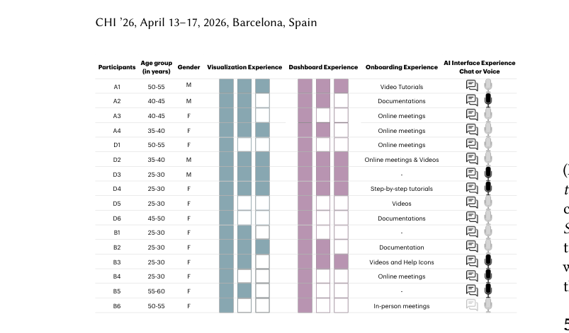
Experience ranged widely, from visualization/dashboard novices to multi-year Power BI users. The Diana group included 3 novices; the baseline group included 1 expert and 4 regular users. This is not a large randomized experiment; it is closer to an exploratory qualitative study.
Tasks spanned easy, medium, and hard levels, and covered lookup, explore, and interpret types. Some involved a single view; others needed multiple coordinated views. The study recorded whether participants finished tasks, whether answers were correct, which modalities they used, and how they explained their strategies in interviews.
Do users actually mix modalities? Yes — and more so as tasks get harder
In the Diana group, users did not stick to one mode. On simple tasks, many finished alone or used Diana only for confirmation. On medium and hard tasks, they began switching modalities frequently.
A typical pattern in the paper: users first select a dashboard region with mouse or lasso, then follow up by voice, and switch to keyboard chat when they need more stable written steps. For complex tasks, D2, D3, D4, and D6 all used mouse and voice, and often restated questions in their own words.
As Figure 4 suggests, multimodality is not evenly distributed decoration; it changes with task complexity. Hard tasks tend to trigger more combinations: mouse defines context, voice asks naturally, keyboard keeps reviewable steps, and visual highlights pin answers back onto the interface.
Versus a static guide, the Diana group made fewer errors and got stuck less
The most direct comparison comes from task completion and correctness. The Diana group had only one unfinished task: D1 could not complete Task 3. The baseline group had five unfinished tasks, from B1, B2, B3, B6, and others.
Wrong answers also clustered in the baseline group. B1 through B6 produced 10 incorrect responses in total — B5 with 5, B4 and B6 with 2 each, B2 with 1. More critically, every baseline participant had at least one task that was either unfinished or wrong.
As Figure 6 shows, the Diana group has more green overall — more correct completions. Baseline problems were not only failure to read documentation, but missing timely confirmation and concrete pointing: participants often calculated by hand, guessed tooltips, misread filter state, and even when correct were unsure they were right.
Diana's most valued combination: voice + visual highlighting
In interviews, voice-based interaction and visual highlights were the most endorsed pair.
Voice's value is naturalness and speed, and it matches the habit of "asking a person." D1, D2, and D6 did not all prefer voice at first, but adopted it during tasks. D2 was initially hesitant about speech, then found it "comfortable, almost not robotic."
Visual highlighting is more direct: it helps users confirm where Diana is talking about. As an expert, D2 could verify whether answers were reasonable; when Diana's replies were natural and accurate, he said he began trusting voice interaction. D3 found interacting with Diana "really fun"; D4 liked that speech did not interrupt dashboard work.
This also explains why a pure-text chatbot is not enough. For dashboard onboarding, users need not a polished paragraph, but "which block on screen this explanation maps to."
Diana does not solve every problem
Diana's largest design limit is no direct access to underlying data. When questions need concrete numerical computation or cross-point aggregation, the system can only provide operational guidance. The paper includes cases where users had to manually sum revenue — exposing the boundary between an onboarding assistant and an analytical agent.
Second, prompt and interaction coverage were incomplete. D1 failed Task 3 because Diana returned a "data unavailable" response, while the onboarding instructions did not explain how to select multiple points on the map. The authors note that prompts can still improve.
Third, multimodal synchronization: visual highlights sometimes did not fully align with voice output, causing confusion. The radial menu was also not universally liked; some found it unfamiliar, overly detailed, or unintuitive.
What this paper really reminds AI product design
First, AI help must enter the context the user is already operating in. When users ask about a dashboard, they need more than text answers — they need the question, chart region, interaction steps, and visual result linked together.
Second, multimodality is not "more is better"; roles must be clear. Voice fits fast questions; keyboard fits keeping steps; mouse fits specifying objects; highlighting fits building visual correspondence. The combination is what matters.
Third, onboarding and analysis should stay distinct. Diana helps users learn to use a dashboard without querying and computing data for them. Moving toward a stronger dashboard agent would require safe LLM access to data while keeping explainable, verifiable interface feedback.
Evidence strength: generative, but not yet large-scale quantitative proof
The paper's strengths are complete design, a concrete scenario, and rich interview detail. It decomposes the real pain of dashboard onboarding into designable elements: input modalities, output artifacts, visual highlighting, and contextual help.
But the sample is small — 12 participants in the main study, 6 per group — and experience is not fully balanced. The authors did not compare task completion time, because time is heavily affected by task understanding and modality familiarity. Results are better treated as exploratory evidence than as strict proof that Diana beats static guides on every dashboard.
Diana's current implementation also targets Power BI. The authors believe the design can transfer, but it has not been validated on Tableau, Looker, Superset, or custom dashboards. Cross-platform stability still needs further study.
Three judgments worth taking away
First, a dashboard AI assistant should not be only a chat box. If answers cannot point to concrete chart regions, users still bear heavy mapping costs.
Second, visual highlighting may be a key output modality for dashboard AI. It moves explanation from language back onto the interface and reduces "I understood, but I don't know where to click."
Third, complex tasks naturally push multimodal combinations. Users can handle simple tasks alone; the harder the task, the more mouse, voice, keyboard, and highlight need to collaborate.
Key terms
📊 Dashboard Onboarding: The process of helping users understand dashboard structure, interaction patterns, and task paths.
🗣️ Multimodal Interaction: Users can interact with the system through voice, text, mouse pointing, and related channels.
✨ Visual Highlighting: The system highlights relevant charts, axes, legends, or regions on the dashboard so explanation and interface objects correspond.
🧭 Situated Assistance: Placing help in the user's current task and interface context, rather than offering generic instructions.
References
Dhanoa, V., Molina León, G., Hoggan, E., Gröller, E., Streit, M., & Elmqvist, N. 2026. "Hey Dashboard!": Supporting Voice, Text, and Pointing Modalities in Dashboard Onboarding using Large Language Models. In Proceedings of the 2026 CHI Conference on Human Factors in Computing Systems. ACM. https://doi.org/10.1145/3772318.3791766